


Why Your Product Pages Load Slowly (And How to Fix Image Delivery)
You've invested in beautiful product photography. High-resolution images showcasing every detail. Multiple angles, zoom capabilities, lifestyle shots. Then you check analytics: high bounce rates, abandoned carts, poor mobile conversions. Customers leave before pages finish loading. The problem isn't your products or photography. It's how those images are delivered. Google found that as page load time increases from 1 to 3 seconds, bounce probability increases by 32%. From 1 to 5 seconds. It jumps to 90%. For e-commerce, every second of delay costs 7% of conversions.
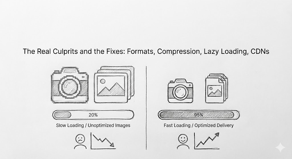
The Real Culprits Behind Slow Product Pages
Images account for roughly 50-70% of total page weight on e-commerce sites. While you may have optimized your code, configured your servers, and streamlined your checkout, unoptimized images silently kill performance.
1. Oversized Images
Your photographer delivers 4000x3000 pixel images at 8MB each. Perfect for print, catastrophic for web. Most product images display at 800-1200 pixels wide on desktop, 400-600 pixels on mobile. Serving the full-resolution file forces users to download 10x more data than their screen can even display. A single oversized product image can take 5-10 seconds to load on mobile 3G—longer than most visitors will wait.
2. Wrong File Formats
JPEG has been the web standard for decades, but it's no longer the most efficient option. Modern formats like WebP and AVIF deliver the same visual quality at 25-35% smaller file sizes. A 500KB JPEG becomes a 350KB WebP with no visible quality loss. Across a page with 12 product images, that's saving 1.8MB of bandwidth. Most e-commerce platforms still serve only JPEG or PNG by default. Browsers that support more efficient formats download unnecessarily large files because the right formats aren't available.
3. Uncompressed Files
Even within the same format, compression makes an enormous difference. A JPEG saved at maximum quality might be 2MB. The same image compressed to 85% quality (visually identical to most viewers) drops to 400KB—an 80% reduction in file size. Many content management systems upload images at whatever quality photographers export them, with no automatic optimization. The result: massive files that could be 70-80% smaller without noticeable quality loss.
4. Loading Everything Immediately
The average product page includes 8-15 images: main product shots, thumbnails, related products, promotional banners. Traditional approaches load all images immediately when the page loads, whether users scroll down to see them or not. This "eager loading" slows initial page render—the critical moment when users decide whether to wait or leave. Images below the fold (not initially visible) should load only when users scroll toward them.
5. Not Serving Device-Appropriate Sizes
A desktop user on a 2560px monitor and a mobile user on a 375px screen both get the same 1200px product image. The desktop user's image looks small. The mobile user downloads 10x more data than necessary, waiting longer for an image that will be shrunk by their browser anyway. Responsive images serve different sizes based on device and screen resolution, but many e-commerce platforms still serve one-size-fits-all files.
6. Poor CDN Usage or No CDN at All
Even perfectly optimized images load slowly if they're delivered from a single server location. A user in Singapore accessing images hosted in Virginia waits for data to travel halfway around the world. Without a Content Delivery Network (CDN), every image request makes this round trip. With a CDN, images are cached at edge locations near users, reducing latency from 300ms to 30ms.
How to Fix Image Delivery
You don't need to reshoot photography or redesign your site. You need better image infrastructure.
Automatic Format Conversion
Modern infrastructure serves optimal formats for each browser. Browsers supporting WebP get WebP. Older browsers get JPEG. This reduces image payload by 25-35% automatically.
Intelligent Compression
Set quality levels appropriate for context: hero images at 90%, thumbnails at 75%. Apply compression automatically at upload or delivery. Manual optimization doesn't scale with thousands of products.
Lazy Loading
Load images as users scroll, not all at once. This prioritizes visible content and improves initial page load dramatically.
Responsive Images
Serve different sizes based on viewport and screen density. Desktop gets 1200px, mobile gets 400px. Users download only what their device needs.
CDN Edge Delivery
Distribute images across global locations so users download from nearby servers, reducing latency from 300ms to 30ms.
Right Optimization Level
Optimize aggressively: Thumbnails, mobile heroes, above-the-fold content
Balanced: Desktop heroes, galleries, banners
Lighter: Zoom views, technical diagrams, text overlays
Measuring What Matters
Before optimizing, establish baselines with Core Web Vitals (Google's metrics):
- Largest Contentful Paint (LCP): Under 2.5 seconds
- First Input Delay (FID): Under 100ms
- Cumulative Layout Shift (CLS): Under 0.1
Track business impact: cart abandonment, conversion rates by device, bounce rates, session duration.Tools like Google PageSpeed Insights and Chrome DevTools show exactly which images slow your pages and by how much.
The Architecture That Scales
API-first media infrastructure handles optimization automatically:
- Accepts images in any format, any size
- Optimizes based on context
- Delivers through global CDN
- Serves responsive sizes and modern formats
You upload originals once. Infrastructure handles format conversion, compression, sizing, caching, and delivery.
Quick Wins to Start Today
Don't wait for a complete infrastructure overhaul. Start with high-impact changes:
- Enable lazy loading on below-the-fold images
- Compress existing images to 80-85% quality
- Implement responsive images for mobile-vs-desktop differences
- Add a CDN if you don't have one
- Audit your heaviest pages and optimize the worst offenders first
You upload originals once. Infrastructure handles format conversion, compression, sizing, caching, and delivery.
Even implementing two or three of these can improve load times by 40-60%.
Why This Matters Now
Page speed is a Google ranking factor. Mobile performance affects search visibility. Users expect sub-2-second page loads. Your competitors are optimizing. But the real reason this matters: every second of delay directly impacts revenue. Faster pages convert better. Mobile users complete more purchases. Organic traffic improves. Customer satisfaction increases.
Your product photography is an asset. Make sure slow delivery isn't turning that asset into a liability.


